UNQORK DESIGN SYSTEM
DESIGN SYSTEMS | UX DESIGN | UI DESIGN


Impact
My work has been critical to the evolution of Unqork’s design system, ensuring it remains scalable, consistent, and adaptable as the product grows. After three major migrations, Figma became the single source of truth, making my role essential in maintaining accuracy and consistency across teams. I’ve significantly scaled the system by building and refining components, variants, libraries, and design tokens, defining best practices, and reinforcing a strong foundation for long-term success.
Driving adoption through cross-team collaboration, I’ve enabled teams to implement the system with clarity and confidence. My work includes maintaining documentation, hosting weekly Design System Office Hours, conducting design audits, and tracking design debt and component snowflakes to ensure efficiency and consistency. To support the system’s long-term scalability, I’ve developed a strategic roadmap that guides its evolution and ensures it continues to grow in alignment with product needs.
About Unqork
Unqork enables users to build and manage enterprise-grade software without writing a single line of code with drag-and-drop features.
About Unqork
Unqork enables users to build and manage enterprise-grade software without writing a single line of code with drag-and-drop features.
OVERVIEW
Senior Product Designer, Design Systems & Accessibility
2022 - Present
Role
Frameworks
Angular
React
Unqork
Software
Figma
Storybook
Jira
Miro
Illustrator
Context
When I joined Unqork in 2022, as the only design system designer, I found myself in an exciting yet very challenging space: The absence of a dedicated design system designer resulted in a build-up of design and ENG debt. From inconsistency and accessibility shortcomings to outdated and dysfunctional components, libraries, and patterns, designers and engineers found themselves navigating a lot of inconsistencies while also lacking guidance in creating, updating, and implementing components, in addition to the initial product’s UI library change from Angular to React and eventually from React to our own Unqork library - drinking our own champaign.
My role has evolved throughout the years and I have done most things design systems, from component/library creation to working with different teams and leadership to prioritize features and projects including accessibility at a product level.
STRAIGHT FACTS TO THE TABLE
Before I highlight some of my work, I know some peeps like to see numbers! Below are some of the tangible things that I have built in the design system 👇🏼
35 Unqork DS Components
4 New
Libraries
MY CONTRIBUTIONS OVER TIME
Big and small, I've tackled so many projects at Unqork that if I showed them all with their design processes in my portfolio, they would lose their impact—and let's be real, who has time for that? Not me, certainly 😅
So instead, let me give you a sneak peek into the highlights of what I've been up to as the one and only design system designer at Unqork.
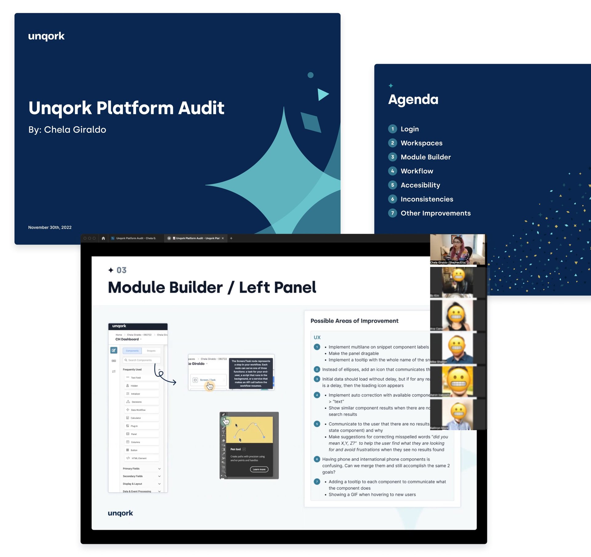
UX Audit
Upon joining the team, my first step was to understand the current state of the product and how the design system influenced it. To achieve this, I conducted a thorough UX audit to identify pain points and areas for enhancement across the product.
Once the audit was complete, I presented my insights and findings to the design team and manager to ensure alignment on areas requiring improvement.
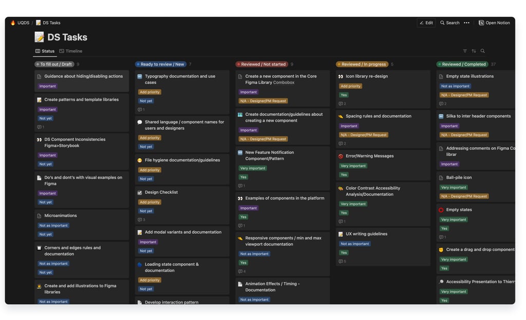
Road map / Tasks
When I identified most of the issues and tasks that required attention post-UX audit, but there was no centralized place to organize priorities and tasks within the design system and other aspects of the platform and its features.
So, I started documenting everything needed in Notion. It looked a little bit overwhelming at first, but it accurately showed the much needed love that the design system and platform needed at that time. Within the first month, I documented over 50 issues and tasks, which helped to create a clearer overview of priorities.
Collaborating closely with product managers and designers, we prioritized and tackled critical areas within the platform while addressing urgent design system issues impacting the platform's functionality.
Design System Support
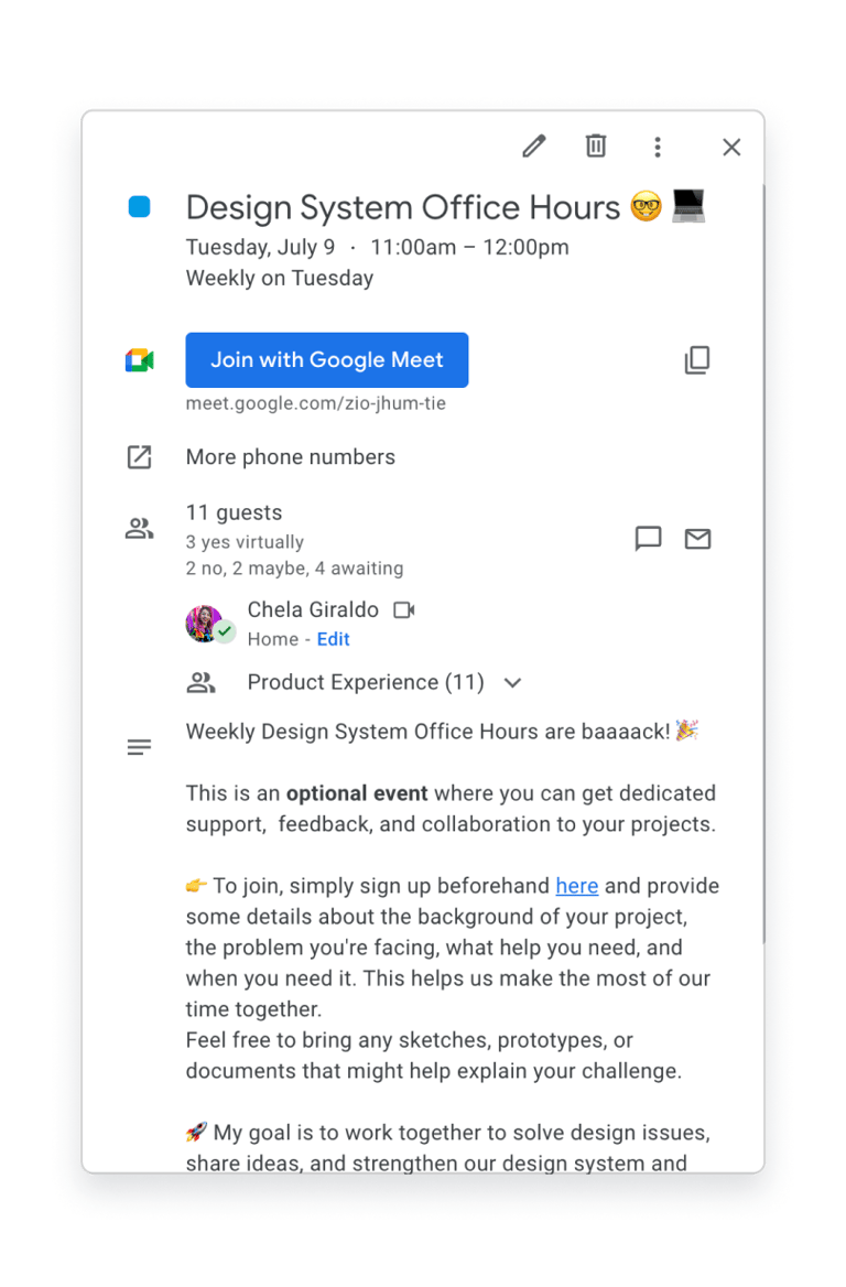
In the need for a central hub for support and information for my 10 designers, I started hosting a weekly meeting called Design System Office Hours. This is where designers and I get together to jam the best ways to use components for different scenarios or to create new components and variants if needed.
Since launching these office hours, I have maintained an average attendance of at least one designer per session, resulting in the creation of 18 new components and 23 new variants.
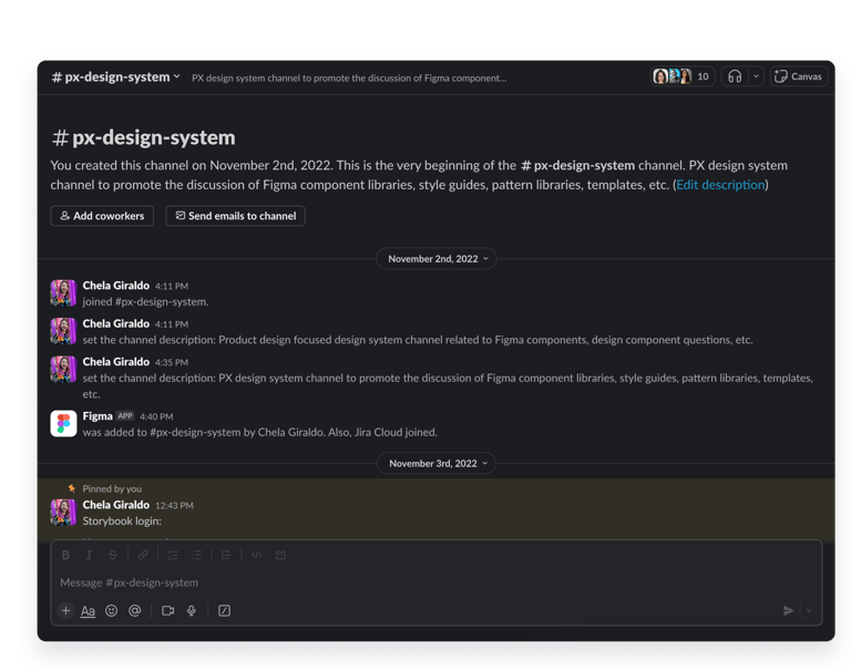
In addition to that, I set up a Slack channel called PX Design System. Every Friday, I post updates there on all the changes made to the design system throughout the week, which keeps the team informed and engaged. My weekly updates have become a valuable resource, with 9 out of 10 designers reporting that they feel more informed and supported which reinforces the insights and knowledge gained during our office hours and encourages ongoing collaboration.

Migration from Angular to React
When the company first began, they hired an agency to develop its product without a clear design system or guidelines in place. As a result, the product ended up looking outdated and felt cold, lacking user-friendliness and accessibility. Initially built in Angular, the decision was made to transition it to React to modernize and make it more user-friendly.
By the time I joined, they had already begun this transition and had established a design system. However, many features still needed to be updated to integrate this new design system. My role was to implement the design system into these new features and ensure they were user-friendly!

Drag the arrows in the panel to see the before (Angular on the left) and after (React on the right) 😎
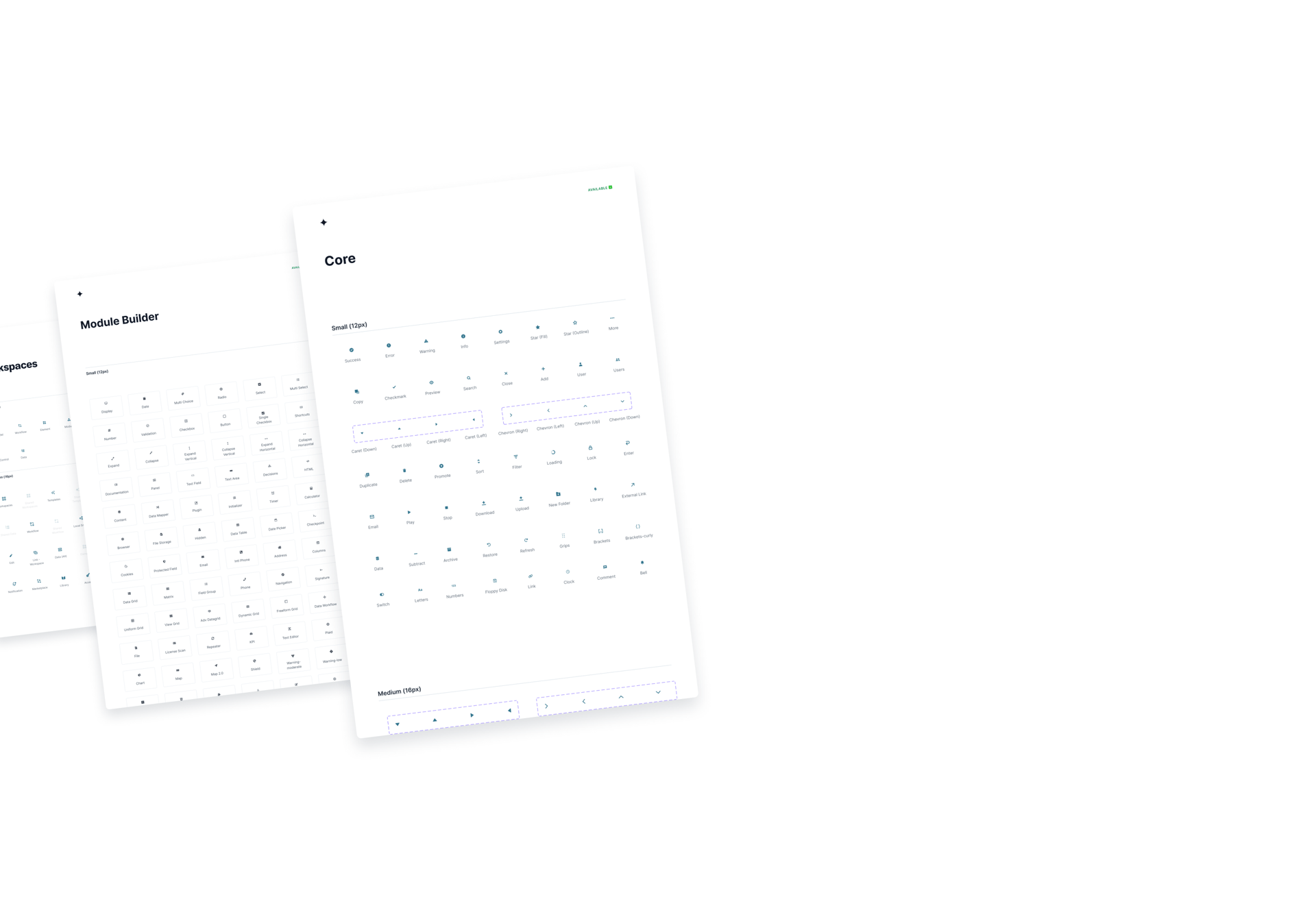
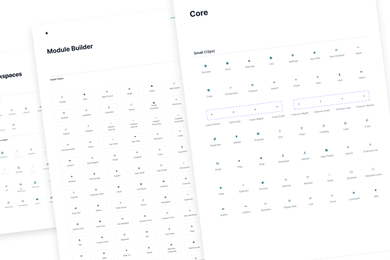
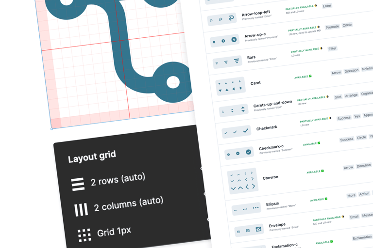
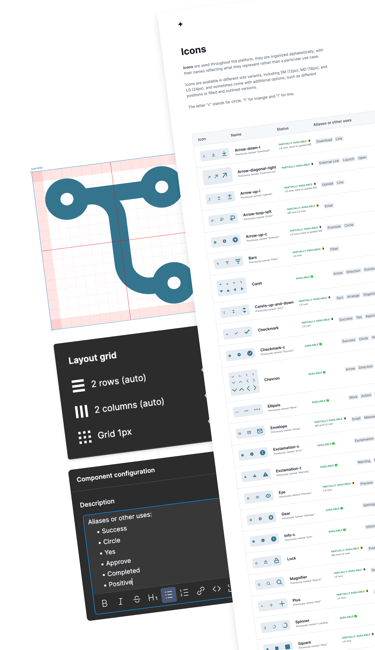
Icon Re Organization
Originally, our icon library was messy, which made it hard for everyone to work efficiently:
❌ Icons were scattered in frames without any logical order and weren’t organized alphabetically, making finding and reusing icons a real headache.
❌ The naming conventions were based on particular names rather than what the icon represented, adding more confusion when trying to find/use an icon.
❌ Icons were organized by size, and while this made it easy to find a specific size, it made it difficult to ensure consistency across sizes.
❌ Icons weren’t uniform because there wasn’t a guide for creating an icon within a specific size, causing inconsistencies in sizes. This led to having the same icon in different sizes with different vectors.
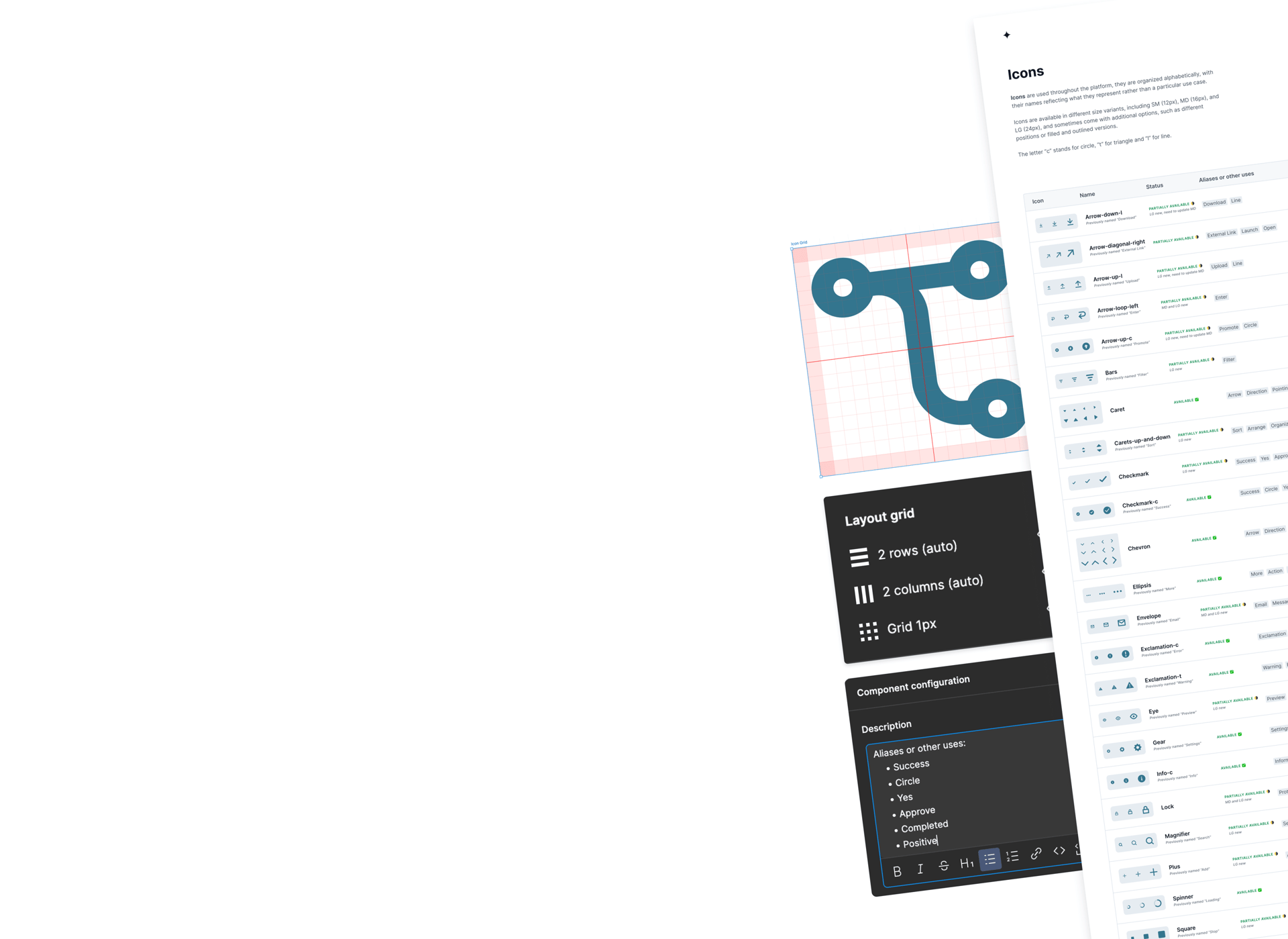
To fix this, I reorganized everything.
✅ I arranged the icons alphabetically and created one component with different sizes for each icon, converting 524 icon components into 224! This made a HUGE difference in the size of the file and the performance of Figma.
✅ I standardized the naming conventions and kept the old names as aliases, adding more aliases for common uses to make it easier to find an icon.
✅ I created a guide on how to create icons, including a grid for consistency.
This reorganization made it much easier for designers and developers to find, use, and maintain a consistent visual style across our platform, speeding up their workflows and making things run more smoothly.
Icon Re Organization
Originally, our icon library was messy, which made it hard for everyone to work efficiently:
❌ Icons were scattered in frames without any logical order and weren’t organized alphabetically, making finding and reusing icons a real headache.
❌ The naming conventions were based on particular names rather than what the icon represented, adding more confusion when trying to find/use an icon.
❌ Icons were organized by size, and while this made it easy to find a specific size, it made it difficult to ensure consistency across sizes.
❌ Icons weren’t uniform because there wasn’t a guide for creating an icon within a specific size, causing inconsistencies in sizes. This led to having the same icon in different sizes with different vectors.
To fix this, I reorganized everything.
✅ I arranged the icons alphabetically and created one component with different sizes for each icon, converting 524 icon components into 224! This made a HUGE difference in the size of the file and the performance of Figma.
✅ I standardized the naming conventions and kept the old names as aliases, adding more aliases for common uses to make it easier to find an icon.
✅ I created a guide on how to create icons, including a grid for consistency.
This reorganization made it much easier for designers and developers to find, use, and maintain a consistent visual style across our platform, speeding up their workflows and making things run more smoothly.
Dark Mode: Meeting a Top Client & Executive Priority!
I led the design and implementation of dark mode across core components and pages, which was a top priority requested by both key clients and internal leadership.
This initiative required auditing our component library and ensuring consistency and accessibility in both themes.
I partnered closely with engineering to align on processes and implementation, and QAed the experience for visual accuracy for every page implemented.
The result was a cohesive, accessible dark mode that improved user comfort and met leadership expectations.
Drag the arrows in the panel to see the light mode (on the left) and dark mode (on the right) 😎
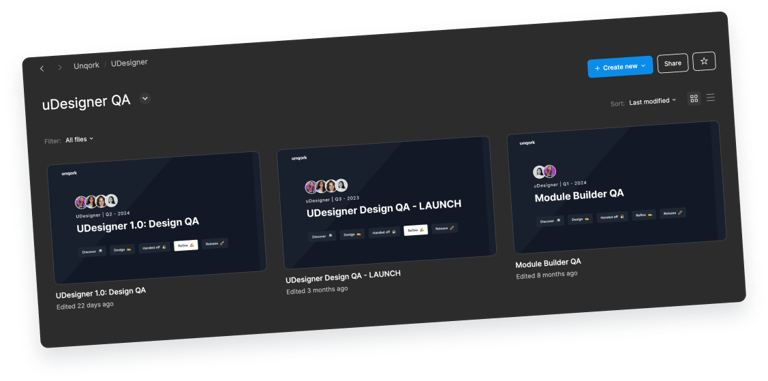
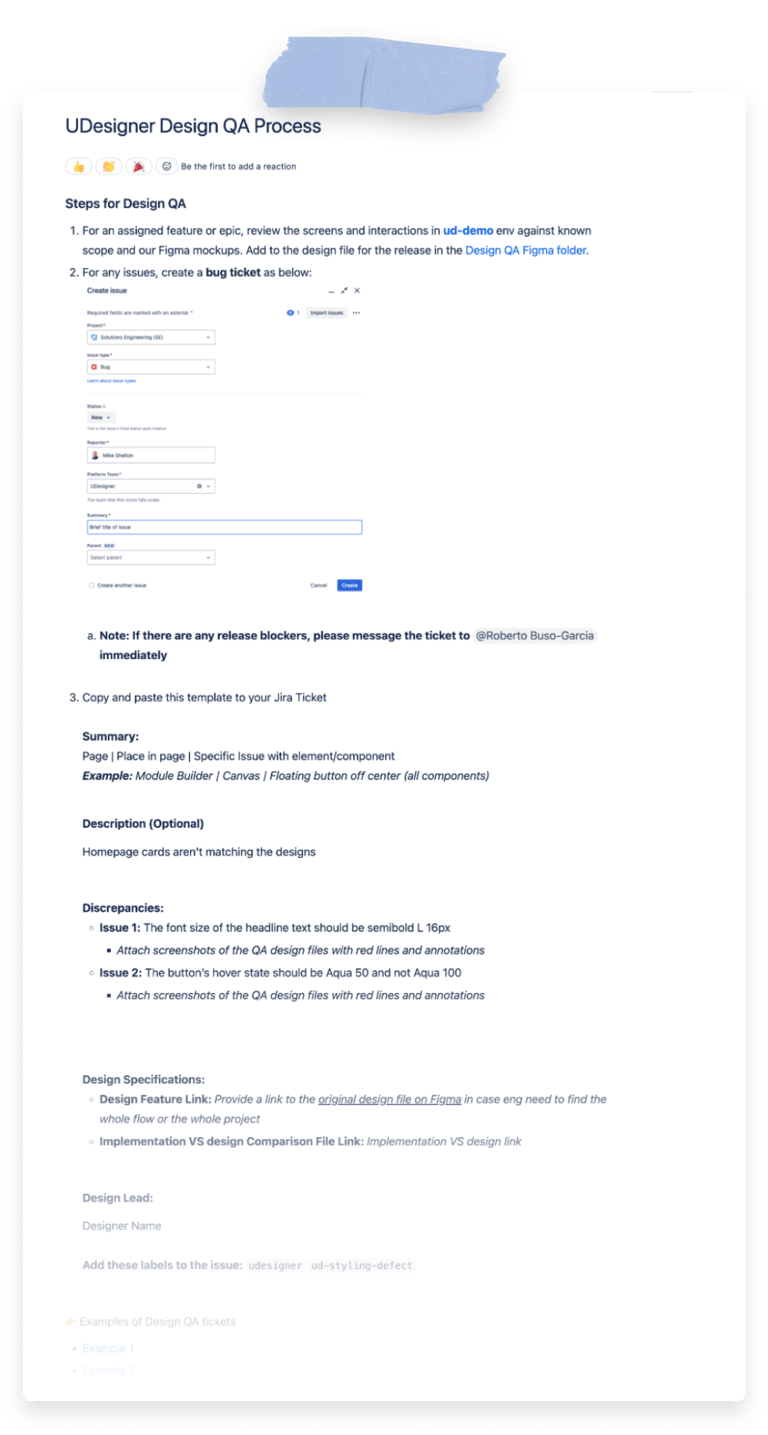
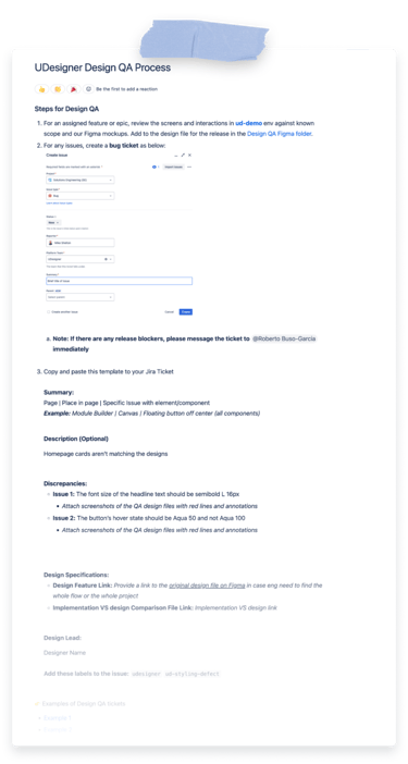
Design QA
In addition to design systems, I also led the design QA process, typically working with a small team of designers, and we focus solely on QA during a tight 2-week timeline every quarter. To streamline the efforts, I implemented a simple process that ensures collaboration and prevents duplicated work. I created a wiki page with clear steps, links, images, and examples on how to create tickets, so designers just need to follow that when creating tickets.
Additionally, I created a dedicated Design QA Figma file, where each quarter has its own page, and within each page, we create frames for every issue we find. We annotate defects, clearly showing and documenting the differences between the original design and the implementation. In each frame, we also document things like the Jira ticket number and the status of it, so we keep track of the progress of these issues, and the next time we start doing QA we start reviewing if the previous QA tickets were implemented correctly.

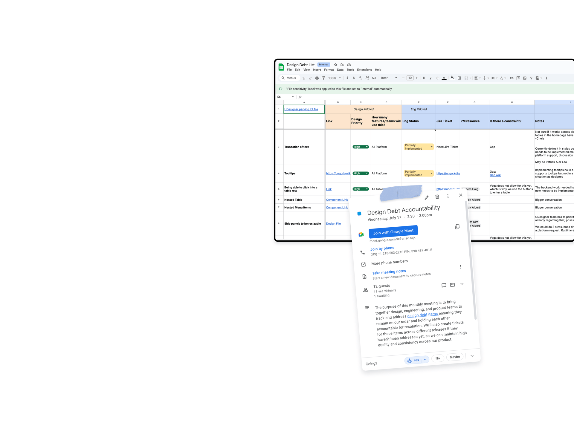
Design Debt List
At Unqork, we rebuilt our platform using our own library, which meant some design elements couldn’t be implemented right away. Like many companies, we had to compromise for an MVP, with ENG and Product promising to work on those features later.
To keep track of these important design elements, I created a design debt spreadsheet. It helped us stay accountable and ensured we didn’t lose sight of key features that were vital for a smooth user experience.
I also set up a monthly meeting with Engineering, Product, and Design to track progress, discuss priorities, and ensure these features were implemented as we moved forward.
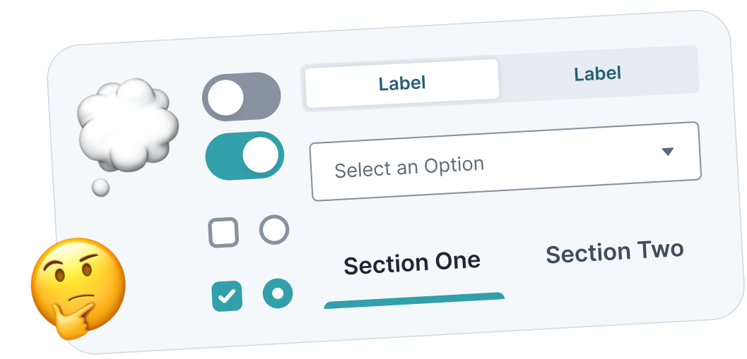
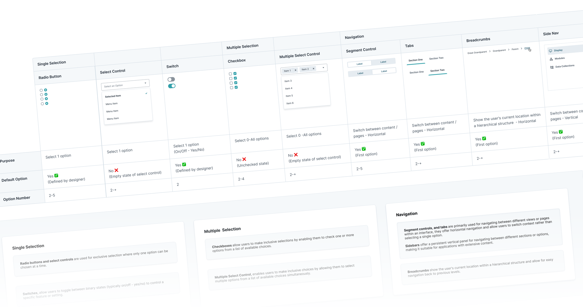
Documenting Form Controls
In many of my design reviews in design system office hours, I noticed some designers weren't implementing form controls correctly, and I found myself repeating why one or other form control should be used in different scenarios, I realized there are a lot of components and may not be as obvious for other designers which component to use.
I wrote additional documentation with different scenarios to guide designers to use the right form control.
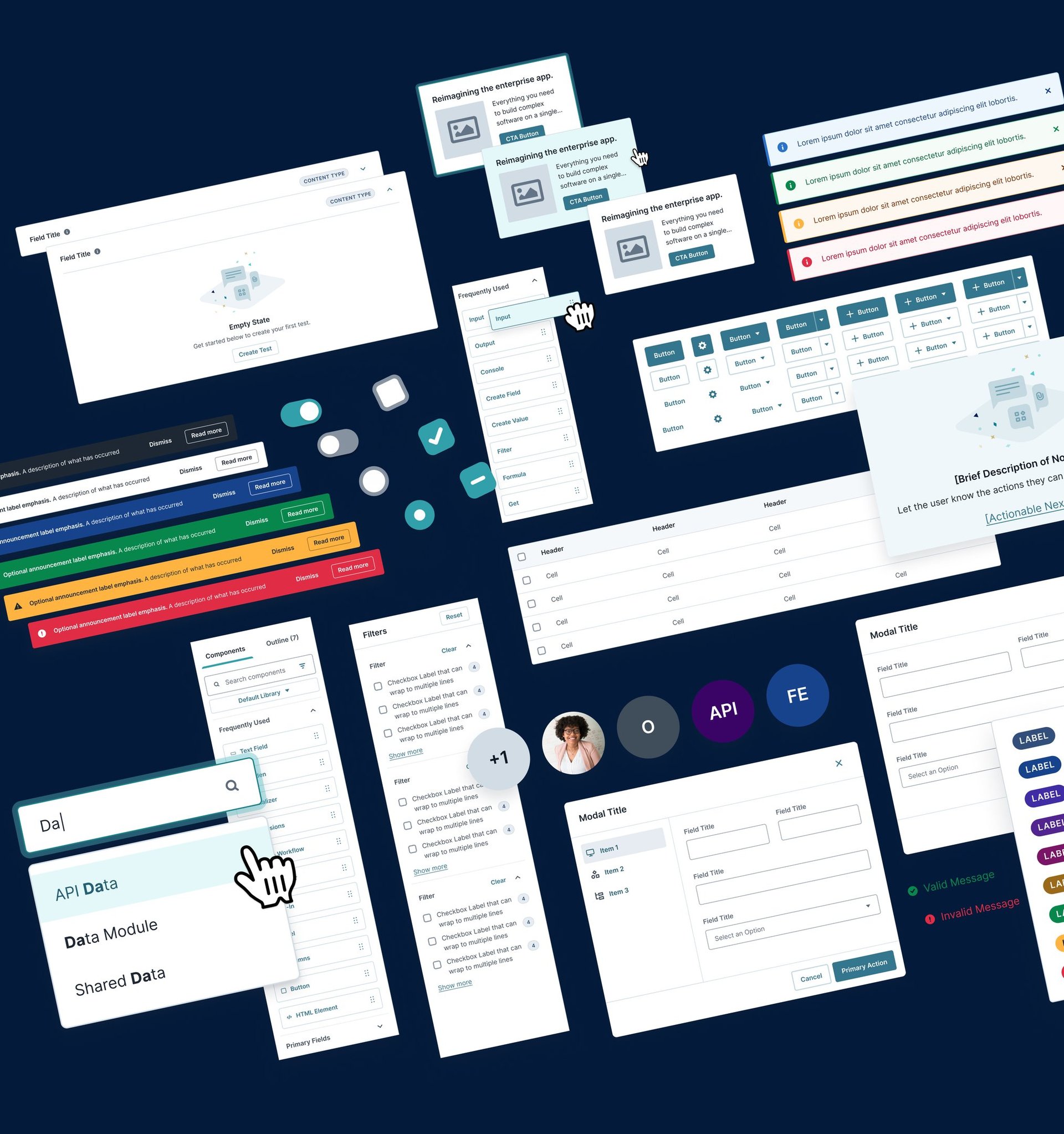
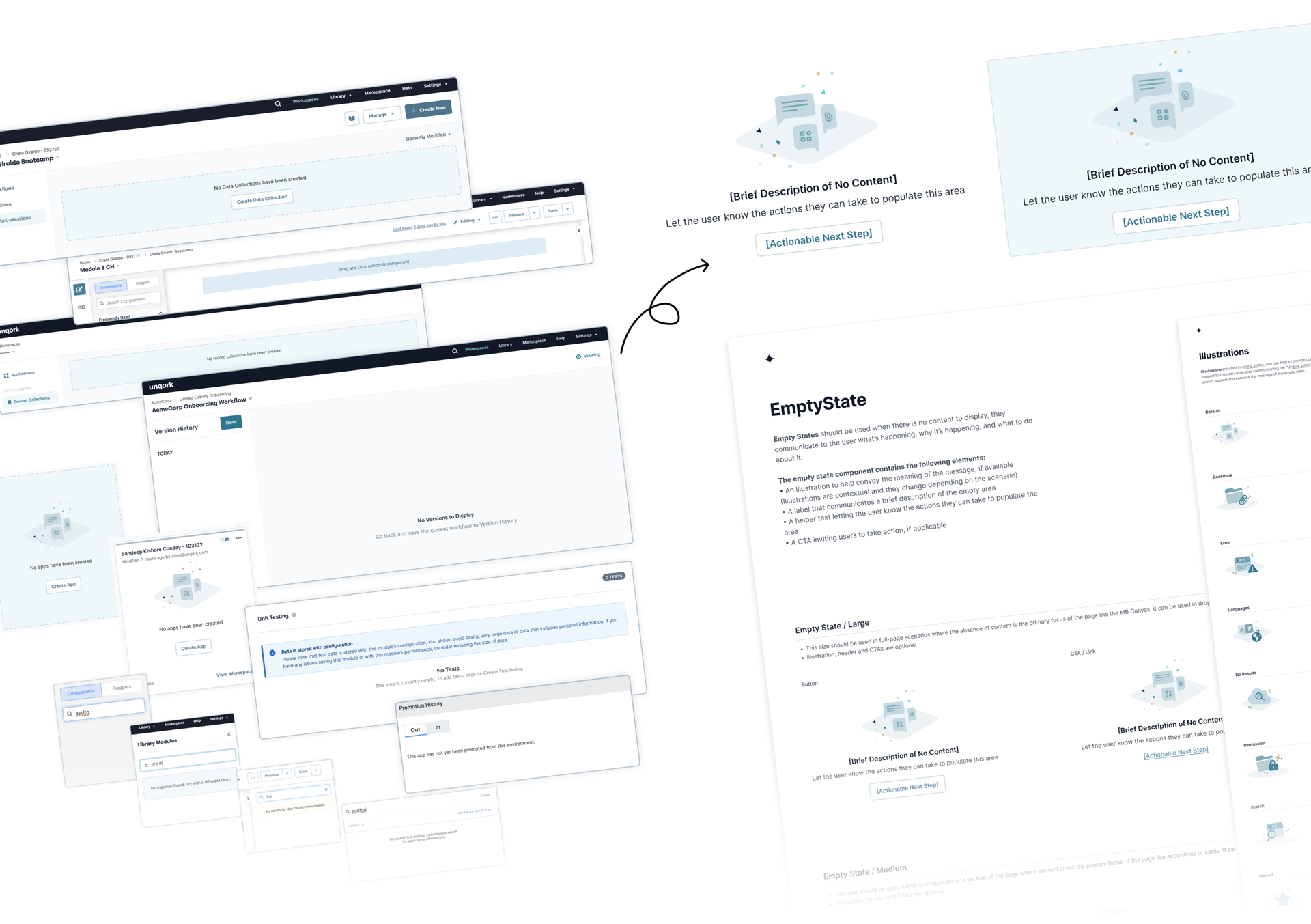
EXPLORING OPPORTUNITIES FOR NEW COMPONENTS
I spotted a great opportunity to improve our platform by identifying and gathering scenarios with repetitive elements that didn't have a unified component.
I found many similar scenarios that lacked a component and created new components with properties tailored to real and current use cases, which helped with consistency across the platform, enhanced the UX, and reduced design and ENG debt.
👇🏼 Below is an example of one of the components that I created from those scenarios:
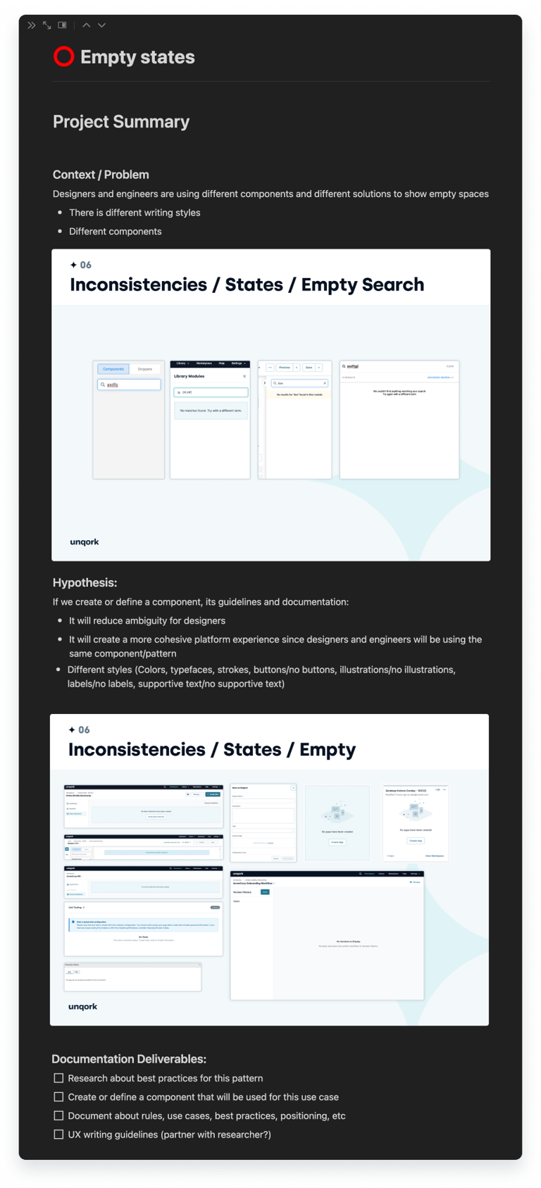
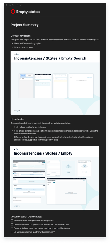
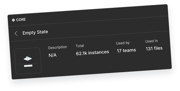
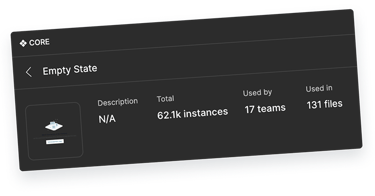
Empty State
The Empty State was a frequently used element by both designers and engineers, but there was no official component, so designers were often creating their own versions. When designers didn’t include an empty state in their handoff, engineers would add a placeholder line, which led to inconsistencies across the platform. I saw this as a perfect opportunity to introduce a much needed new component and make it fun by incorporating illustrations! This component has been used by 11 teams with a total of 2.1K instances a year.
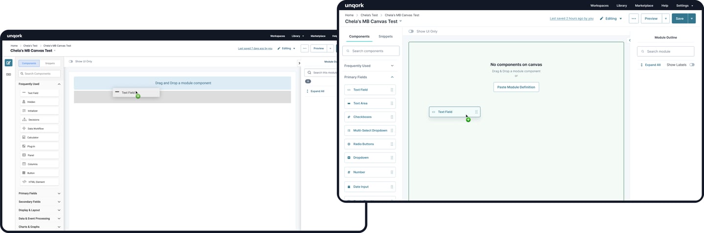
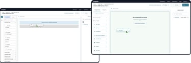
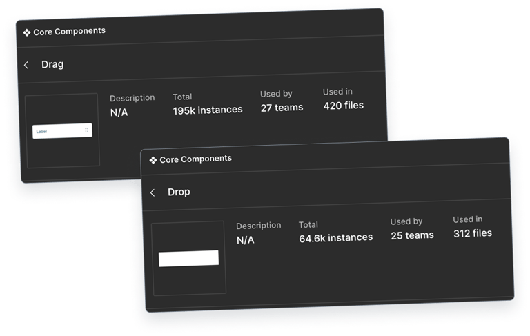
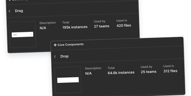
Drag & Drop
The drag & drop pattern is the most important feature in the platform but was pretty inconsistent. The draggable components looked different, had various hover states, and didn’t interact the same way. For instance, some had shadows on hover, while others didn’t. The drop areas also didn’t always let users know where they could drop items, which made things a bit confusing.
To solve this, I created a single drag & drop component with customizable properties to ensure consistency across the board. Now, the drop zones turn green when you hover over them, making it clear where you can drop components.
This component quickly became one of our most popular components with a total of 35,7k instances in just a year, used by 9 teams in 128 files!
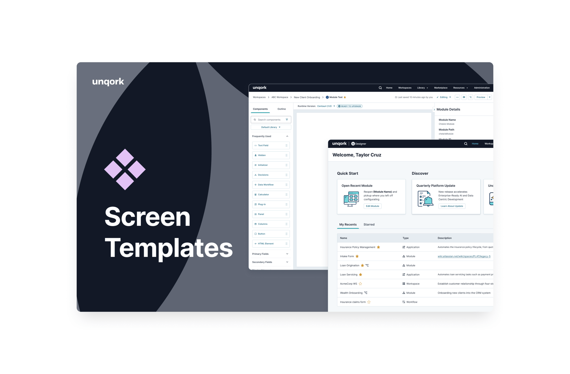
Module Builder
Workflow
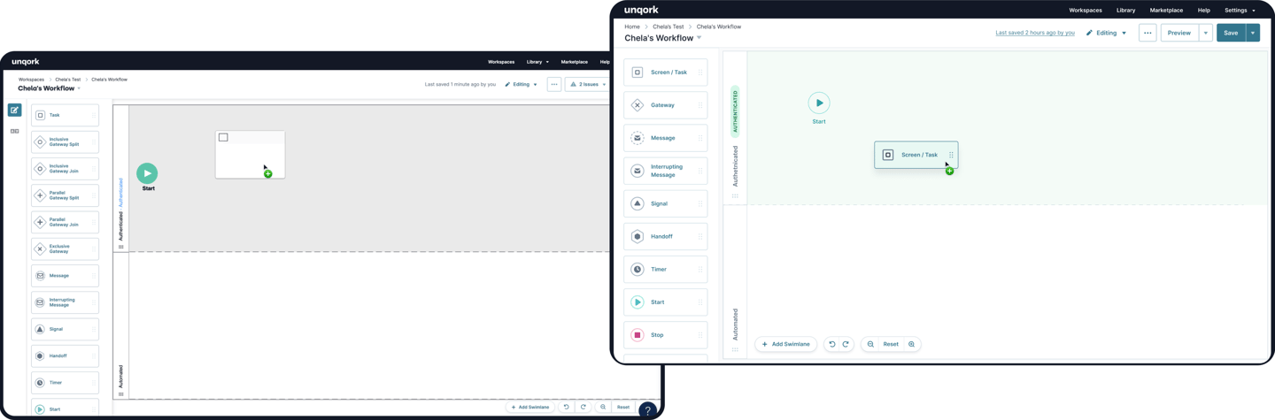
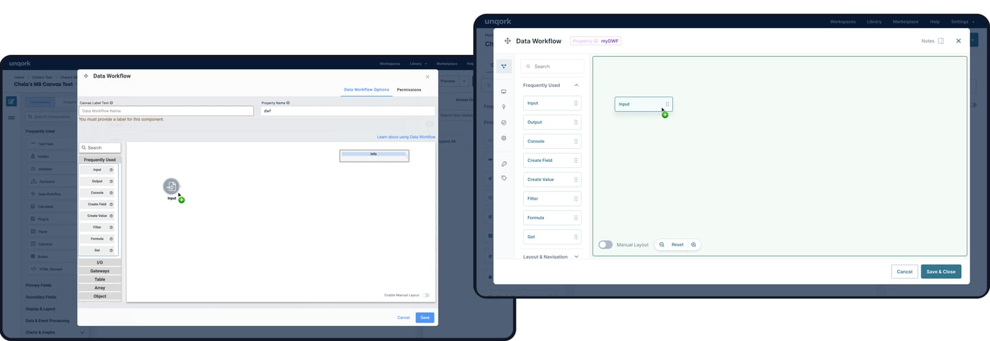
Data Workflow

DESIGN SYSTEM LIBRARIES
At Unqork, I managed 6 design libraries, including 4 I built from scratch, and that served as the foundation of the design system. These libraries accelerated design workflows and enabled a 3x faster handoff.
While some libraries were maintained solely by me, others were structured to support contributions from the broader design team.


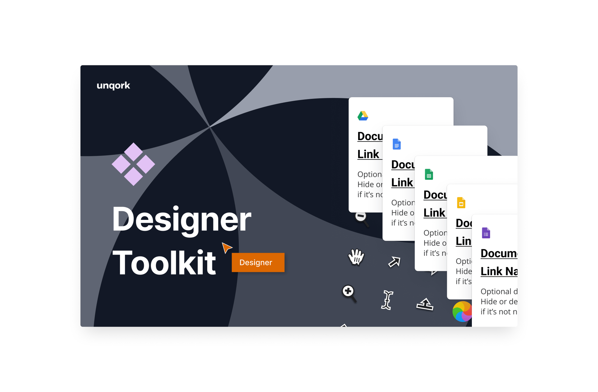
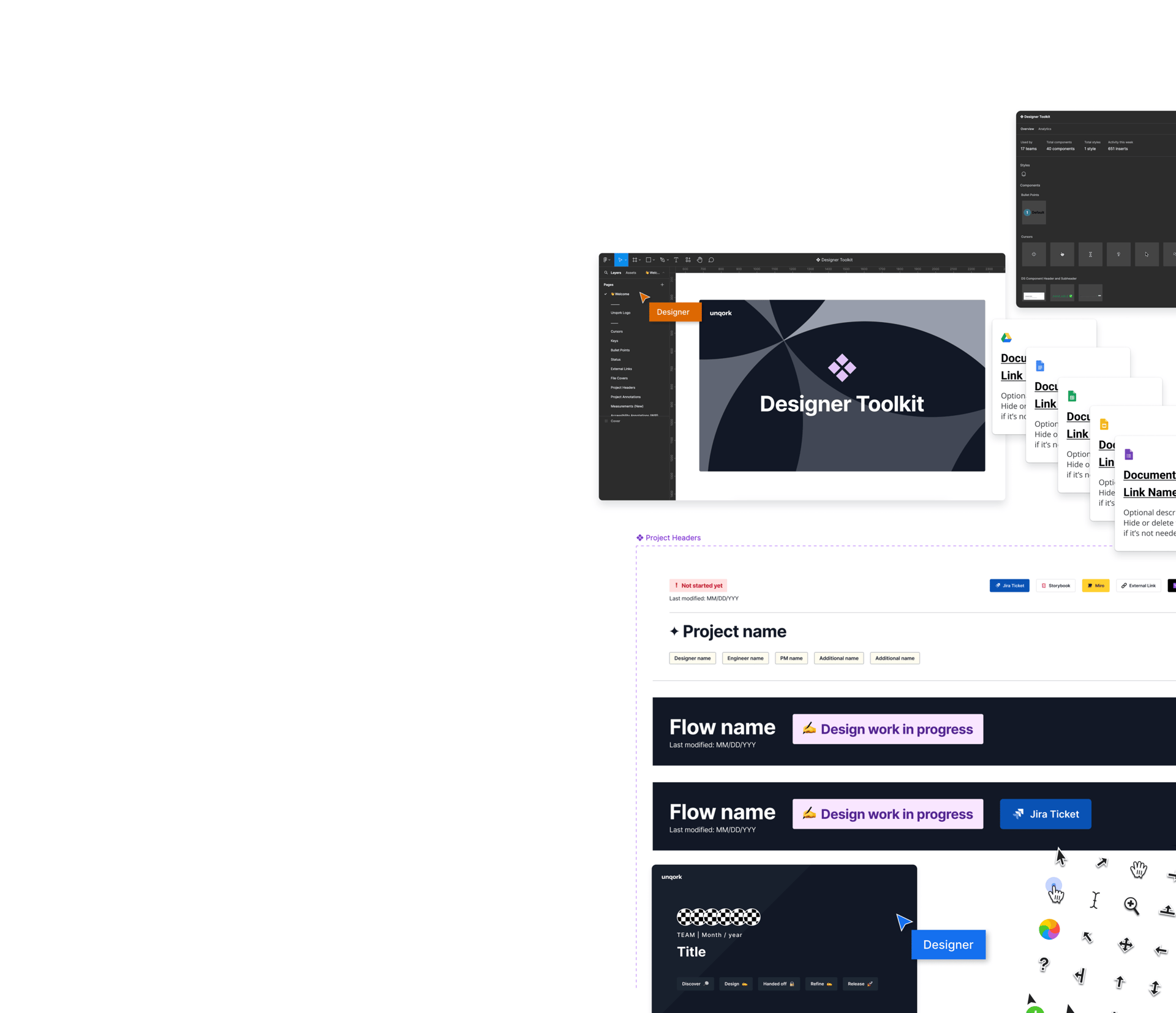
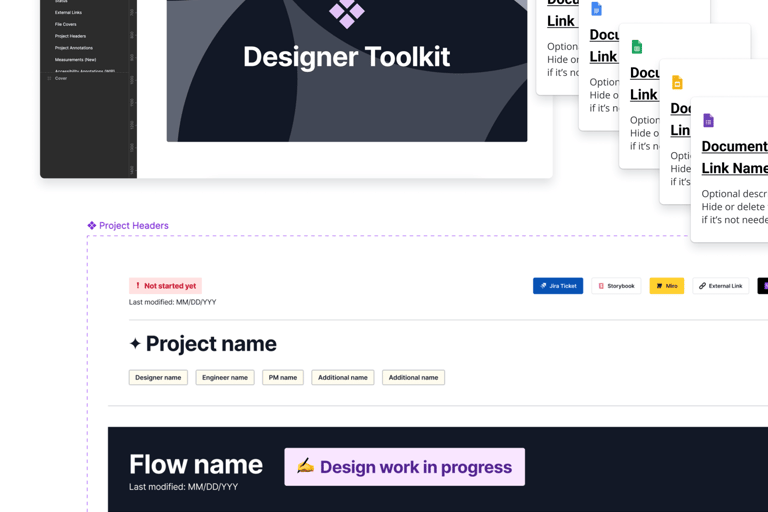
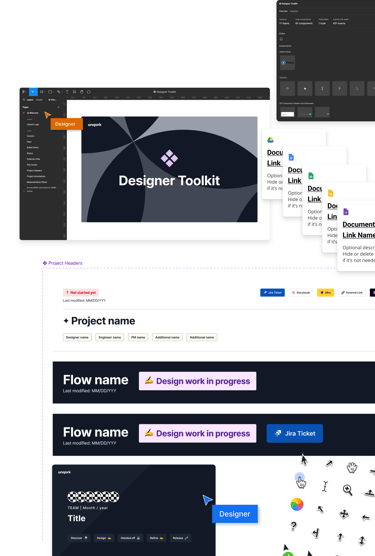
Designer Toolkit Library
I put together a Designer Toolkit Library in Figma to help designers work faster and keep things consistent across projects. With 40 components used by 17 teams, this library has everything from project headers and file covers that show project status, owner, and date, to bullet points, annotations, logos, measurements, and keyboard keys, in short, it has all the little things that save time and keep us organized. There's even a project starter file with useful components to help teams kick off new projects easily.
Since the library launched, it's been a huge help, with designers using it in ALL our projects. It covers most of the things we use all the time, and any new component needed by the team gets added to keep speeding up the design process and maintaining consistency.
Snowflake Library
In many of my design reviews in design system office hours, I noticed some designers weren't implementing form controls correctly, and I found myself repeating why one or other form control should be used in different scenarios, I realized there are a lot of components and may not be as obvious for other designers which component to use.
I wrote additional documentation with different scenarios to guide designers to use the right form control.
GOVERNANCE
At Unqork, I managed 6 design libraries, including 4 I built from scratch, and that served as the foundation of the design system. These libraries accelerated design workflows and enabled a 3x faster handoff.
While some libraries were maintained solely by me, others were structured to support contributions from the broader design team.
WHAT I WOULD LOVE TO FOCUS ON
Honestly, working as a solo design system designer can be overwhelming. There are so many moving parts both within the design system and outside of it, and it’s tough to give everything the attention it deserves. I often find myself multitasking too much, to the point that I am unable to fully dedicate time to some important areas that I believe could greatly improve the design system experience.
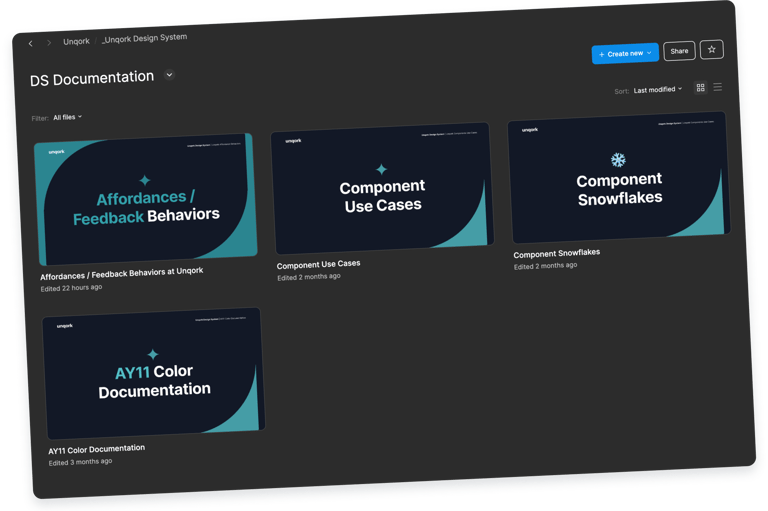
Documentation
Documentation for our components directly in Figma is very important because right now, many designers don’t fully understand how to use components properly, especially the new designers. This leads to inconsistency in the platform.
I would love to expand on documentation by providing more detailed use cases, and explaining component affordances, do's and don'ts, and feedback behaviors.
I would also like to showcase most of the "component snowflakes" so that other designers are aware of those and can use them and maybe promote them as official components if they are popular enough.
I started these initiatives, but it's hard to keep them updated and relevant.
Optimizing Components with the Latest Figma Features
Another thing that I would love to do is ensure that I implement the latest Figma features to our components and have the new props and variables that allow for customization and flexibility without the need to detach components and make them easier and faster to use. Some of our components can slow down Figma due to the number of variants, which impacts the efficiency of designers.
This would not only improve the performance of our files but also encourage designers to stick with the components, knowing they are flexible enough to meet their needs.
WHAT IS CURRENTLY COOKING IN THE OVEN
I’m designing an interface that lets our clients customize the look and feel of their Unqork built applications without any code.
Clients can seamlessly apply their own brand guidelines or design tokens, making their apps consistent and scalable. If they have themes or modes, those can also be incorporated for even more flexibility.
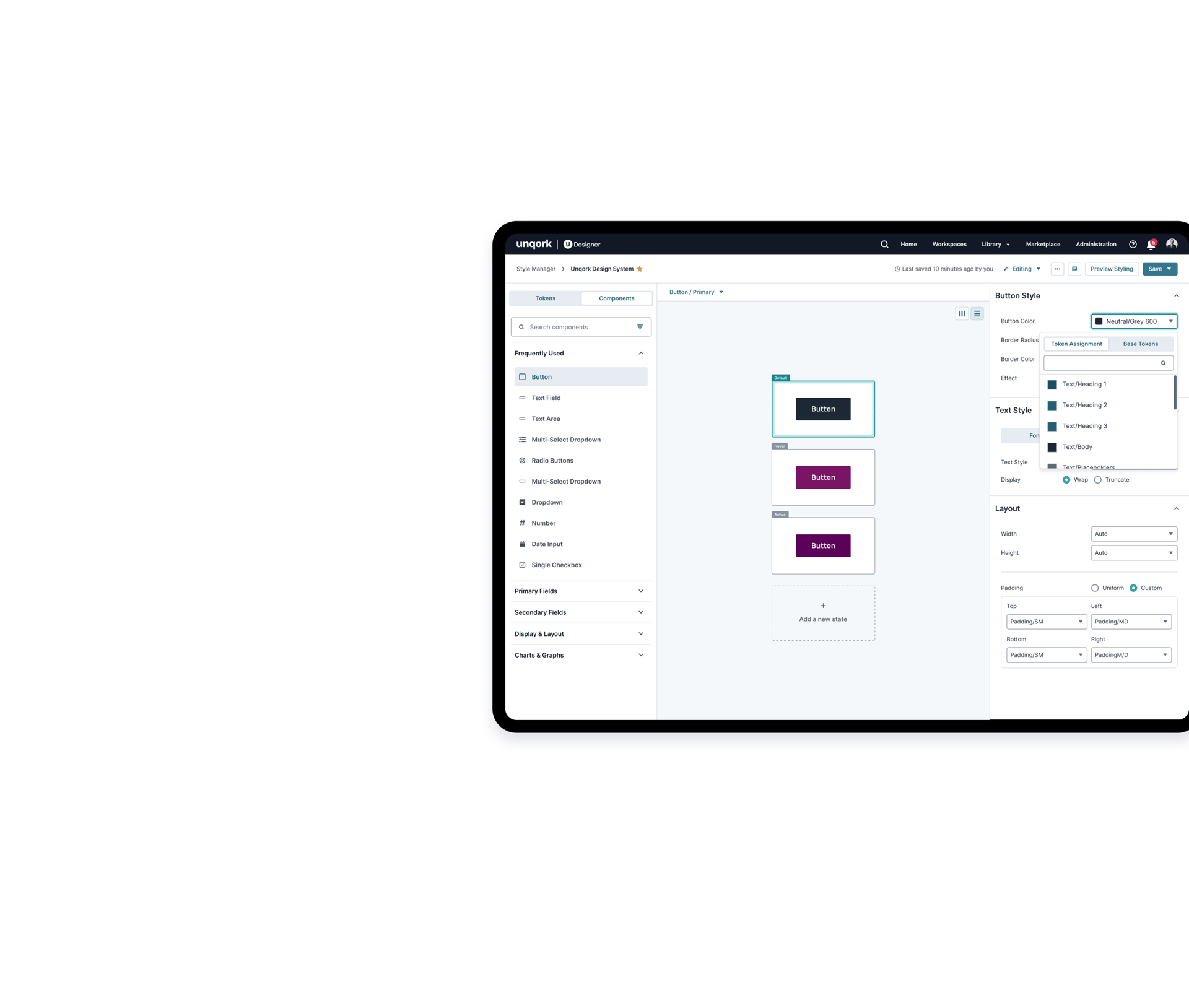
Styling Manager
A New Component Suit
By tokenizing our design system, we create a structured foundation that allows users to easily map their brand tokens to ours. This ensures that when they style our components to match their brand, everything remains compatible, consistent, and simple to update across the platform.
Tokenizing the DS
I’m designing a new component suite that allows our clients to build their applications without writing any code. This new suite is faster, includes built in accessibility features, and fully supports customizable styling.
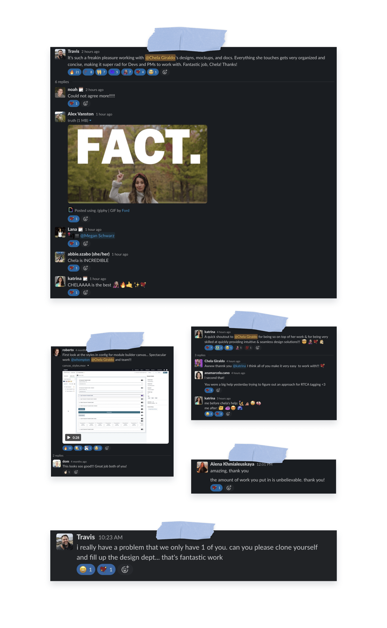
SHOT OUTS AND KUDDOS ♥️
Designing a Scalable Token System & the Style Manager
Building the CBF Design System from the Ground Up
MORE PROJECTS