IMPLEMENTING ACCESSIBILITY AT UNQORK
DESIGN SYSTEMS | ACCESSIBILITY


My work transformed Unqork’s approach to accessibility, making it a core part of the product rather than an afterthought. By enhancing screen reader support, keyboard navigation, and visual accessibility, I ensured that our design system, platform and users applications built with Unqork it met WCAG and ADA compliance.
Focusing on visual accessibility, screen reader compatibility, and keyboard navigation compliance, I led efforts to integrate essential accessibility attributes into the backend of the design system components and introduced configurable settings that enabled users to add accessibility settings without writing code. At the platform level, I improved keyboard navigation by making critical interactions like drag and drop fully accessible ensuring our product was inclusive and usable for all.
Impact
"Accessibility in design is a form of empathy: trying to reach beyond your own personal perspective to try to understand other people who, in this case, very literally don’t see the world the same way you do."
Backgorund
Unqork enables users to build and manage enterprise-grade software without writing a single line of code with drag & drop features.
This means that not only does the product need to be accessible, but it also needs to provide the tools necessary for our users to create accessible applications.
When I joined Unqork in 2022 as a design system designer, I never anticipated taking on a leading role in accessibility. Accessibility wasn’t even mentioned in the job description, but as I learned more about the product, I noticed many accessibility issues. These problems made the product harder to use for everyone and completely unusable for some people with disabilities.
As an accessibility advocate, this felt like a huge opportunity to make a meaningful impact, and I knew the design system was the best place to start because it’s the product's foundation, and changes there would scale and have sweeping changes across. That’s when I decided to step up and make accessibility a priority at Unqrok no matter how I needed to get there.
Let me show you the initiatives that I have led to implement accessibility at Unqork 👇🏼
MY CONTRIBUTIONS
Starting with an Accessibility Audit
The first step was understanding the scale of the problem. I partnered with QA engineers, who were conducting an accessibility audit from the code perspective, while my focus was on auditing the design system and its components. Together, we aimed to get a complete picture of the platform’s accessibility gaps.
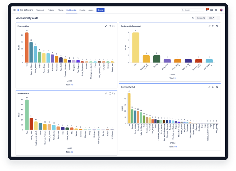
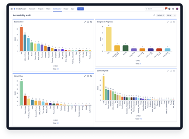
DESIGN SYSTEM AUDIT
In this audit, I analyzed how components were designed and implemented, evaluating components, variants, and patterns against accessibility standards (WCAG 2.1). The audit uncovered critical issues:
60+
Color contrast
40+
30+
170+
Missing focus states
Hierarchy & layout
Total issues
How Design Systems Impact at Scale
Below is an example of many of the issues that I found from the audit:
This modal has several accessibility issues, but I will focus on just how many issues there are with low color contrast. As you can see, there are many color contrast issues, and the culprits? Only 3 components.
This example illustrates the significant impact a design system can have at scale. This modal represents only one of the thousands of instances across the platform where these components are used, demonstrating how accessibility issues in core components can propagate widely and quickly.
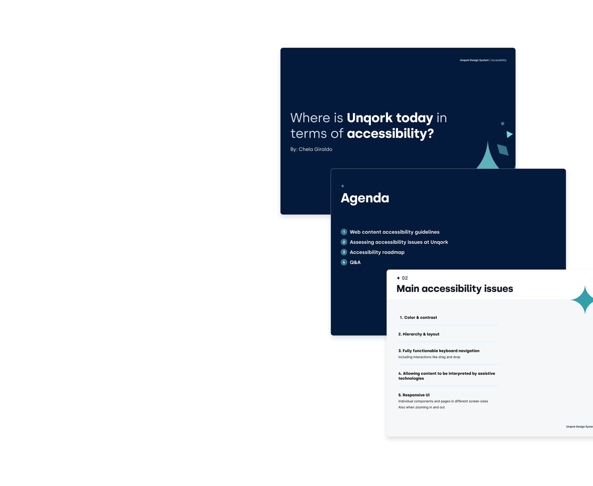
Leadership Pitch
For the leadership pitch, I focused on delivering a clear and compelling case for addressing accessibility issues at Unqork. The presentation was designed to be under 10 minutes, balancing brevity with impact, and aimed to create a strong sense of urgency. Here’s what I covered:
👉🏼 WCAG overview: A quick explanation of the Web Content Accessibility Guidelines (WCAG), emphasizing why they matter and the risks of non-compliance.
👉🏼 Assessing accessibility issues at Unqork: A snapshot of the key accessibility problems identified, showing how these issues were impacting the user experience and creating barriers across the platform.
👉🏼 The ripple effect: Highlighting how accessibility flaws in the design system were cascading into the entire platform, amplifying their impact.
👉🏼 Accessibility roadmap: A concise plan outlining how we could address these issues, including timelines, priorities, and collaboration across teams.
The message was loud and clear: fixing accessibility in our design system wouldn’t just improve our platform; it would empower our clients to do better too.

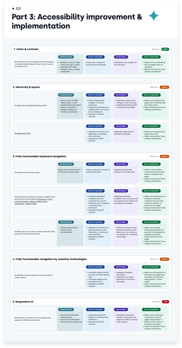
Road Map / Tasks
To ensure the project’s success, I created an accessibility roadmap outlining priorities, timelines, and responsibilities.
The roadmap accounted for contributions from design systems, product design, engineering, and QA teams. Key elements included:
Short-term goals: Addressing critical issues like color contrast and focus states.
Mid-term goals: Enhancing interactive components and hierarchical structure.
Long-term goals: Embedding accessibility best practices into the design system and workflows.
Each task was assigned a level of effort (LOE) and mapped to specific teams for accountability.
Leadership recognized the importance of this and gave the green light, along with the resources needed to get started with fixing the accessibility issues at the design system level. YAY!
Road Map / Tasks
To ensure the project’s success, I created an accessibility roadmap outlining priorities, timelines, and responsibilities.
The roadmap accounted for contributions from design systems, product design, engineering, and QA teams. Key elements included:
Key Accessibility Issues: I identified and organized the most significant accessibility issues by type.
Impact Framework: I created a framework to prioritize issues, focusing on those with the highest impact and the lowest level of effort to address.
Team Involvement: I documented specific requirements and responsibilities for each team, outlining what was needed from each one to kick off the roadmap and ensure alignment across all stakeholders.
Leadership recognized the importance of this and gave the green light, along with the resources needed to get started with fixing the accessibility issues at the design system level. YAY!
GETTING TO WORK
With the roadmap ready and leadership support secured, it was time to get to work. Collaborating with cross-functional teams, we immediately began addressing the accessibility issues.
To manage the extensive number of changes effectively, I created a detailed spreadsheet to track and document every update. A simple Jira ticket wouldn’t have been sufficient to capture the complexity and scale of the work. This system ensured that all changes were organized and easily accessible for reference throughout the project.
As part of this documentation, I also began laying the groundwork for implementing semantic tokens and component-specific tokens.
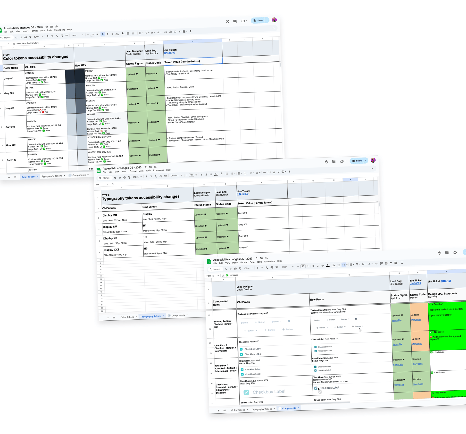
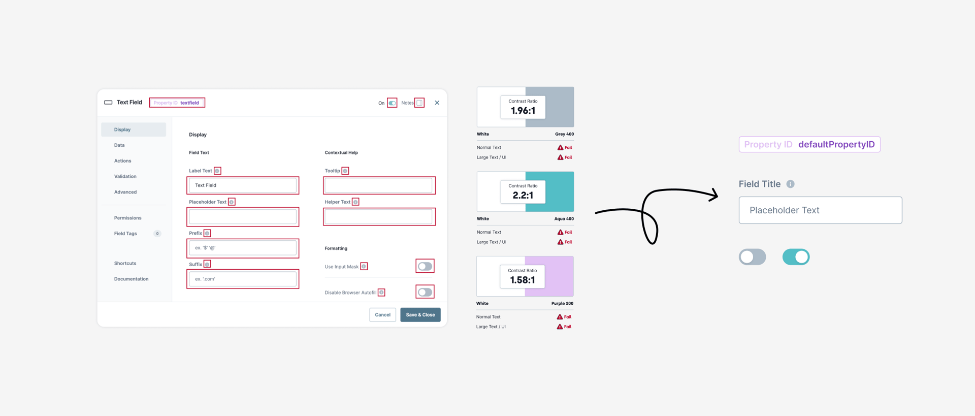
Redefining Colors
To address the color contrast issues, I reviewed each color combination against the primary background (white) to pinpoint the ones failing the most. The main culprits were the middle shades of the palette, particularly Greys and Aquas. These shades were extensively used as primary colors throughout the platform, which significantly amplified their impact on accessibility.
Since the platform doesn't yet have component-specific tokens, manually fixing each component would have been time-intensive. Instead, I resolved most of those issues by shifting the colors to improve contrast. For instance, the hex values of Grey 300 were reassigned to Grey 200, effectively darkening the ones used the most to ensure better contrast. I introduced new colors to complete the palette for the shades missing from this shift.

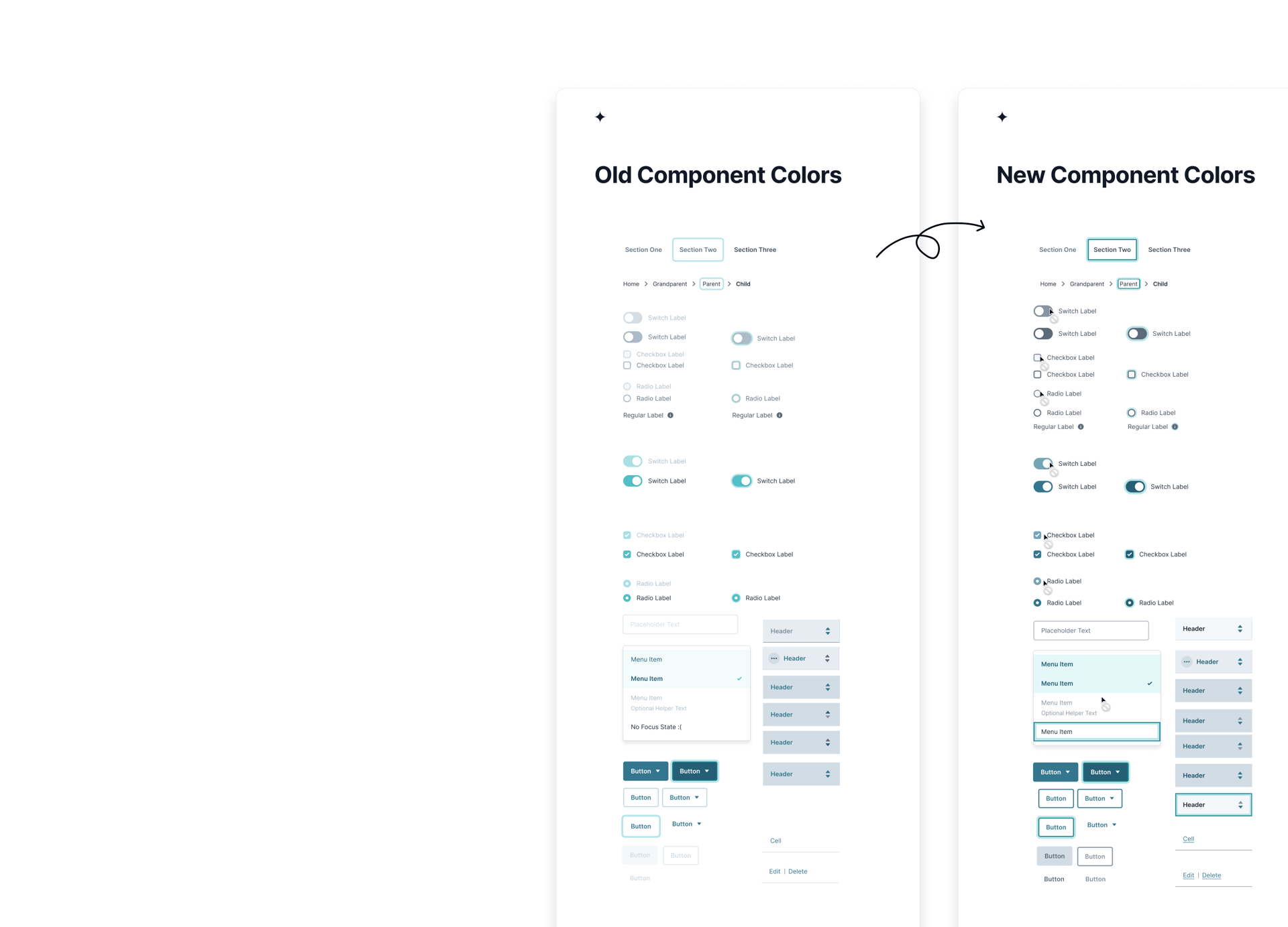
Implementing A11y in Components
To ensure accessibility across components, I updated the color palette, which automatically improved many components, while others required manual adjustments. I addressed missing or low-contrast focus rings by adding clear, high-contrast indicators for all interactive elements. Disabled components were enhanced with a “not allowed” cursor and explanatory tooltips, and I ensured that all links had proper styling, including underlines for clarity.

Drag the arrows in the panel to see the before color contrast edits and after color contrast edits 😎
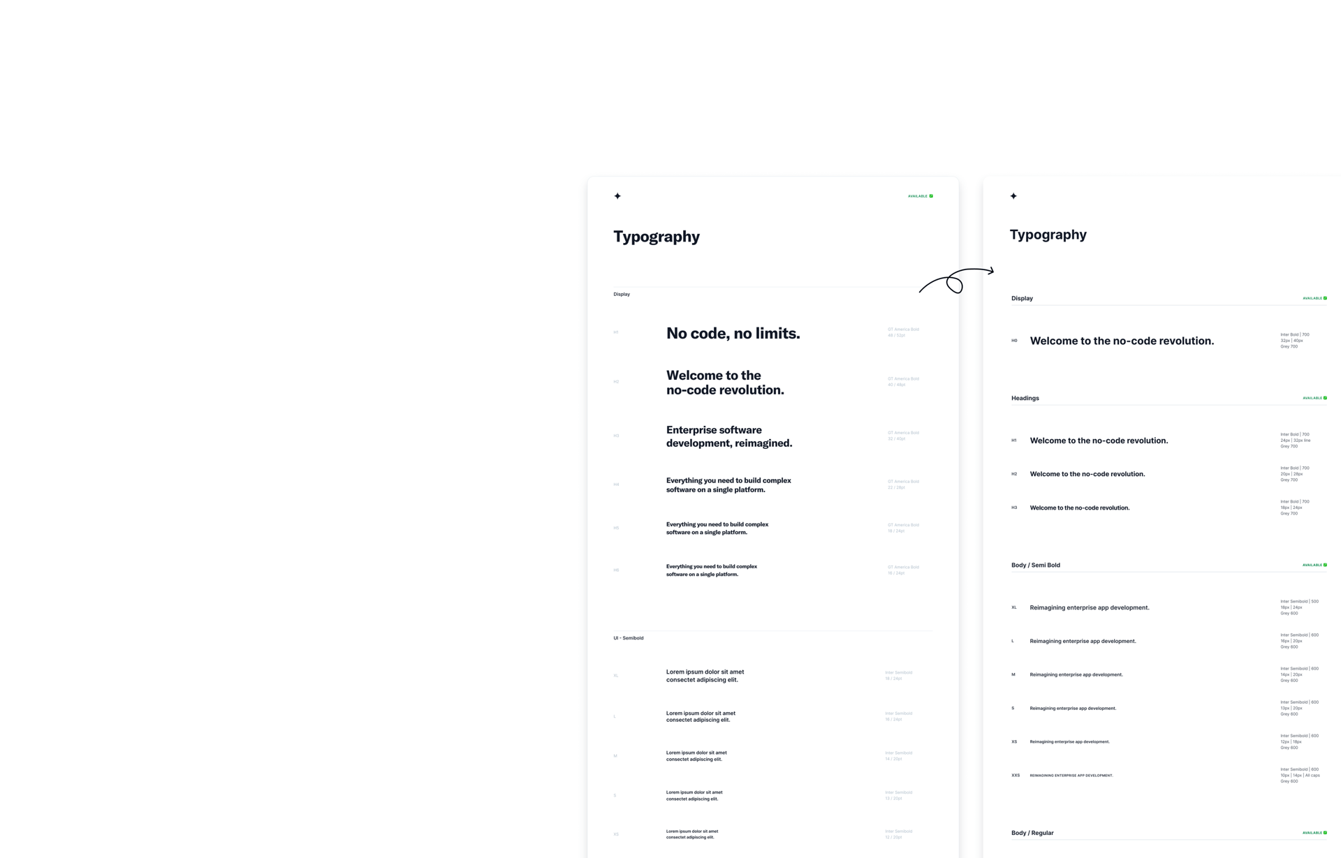
Redefining Heading Levels
I noticed that heading styles weren’t being used consistently in the designs. Some heading levels were skipped, and others were nested incorrectly.
So, I decided to dig deeper to figure out what was going on. It turned out that the headings were oversized, and there wasn’t a shared understanding of how to use them properly. In an application where every pixel matters, it was understandable that designers were avoiding them.
To fix this, I removed the unused text styles, resized the headings to be smaller, more practical sizes, making them easier to include in designs, and defining clear guidelines for heading styles.
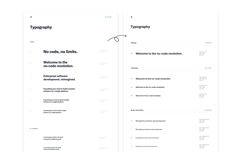
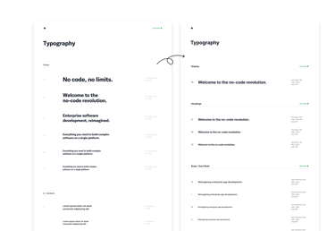
Drag the arrows in the panel to see the before heading level edits and after heading level edits 😎
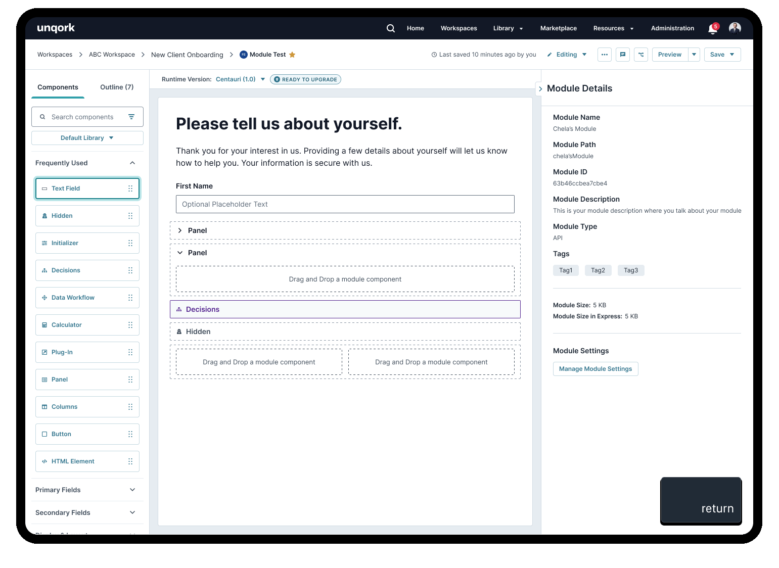
Making Drag & Drop Accessible with Keyboard
One of the biggest accessibility issues was that most of the product wasn’t navigable with a keyboard, and even more critically, its main feature, the drag-and-drop functionality was inaccessible. This posed a significant challenge for users with disabilities and power users who rely on keyboard navigation for web interfaces.
To address this, I put on my keyboard navigation hat. After thorough research and multiple iterations, I designed a solution that enabled users to drag, drop, and move components within the canvas using only a keyboard.
Additionally, I took it further by designing and documenting all interactions to work seamlessly with mouse and keyboard navigation. Each interaction was paired with clear keyboard input requirements to ensure the experience was intuitive, consistent, and inclusive for all users.
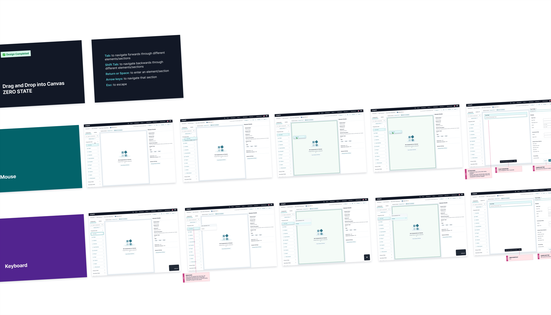
Keyboard interaction showing a text field component being dragged and dropped into the right slot of a column component.
Defining Keyboard Shortcuts
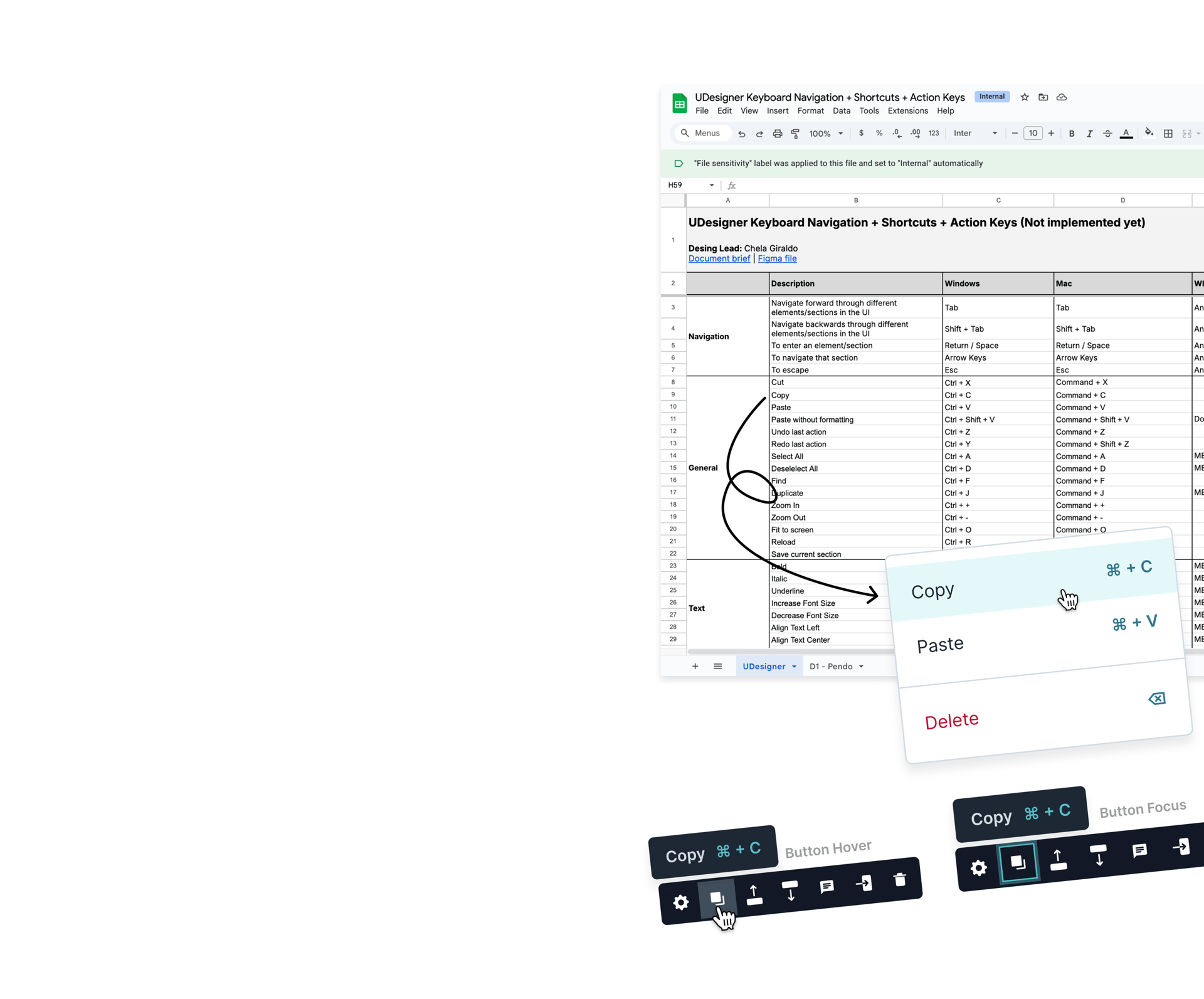
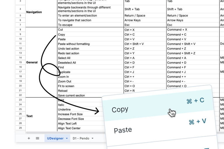
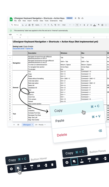
I also took the initiative to define and document keyboard shortcuts as a self-starter project to ensure they were intuitive, consistent, and accessible.
I researched existing shortcuts, analyzed our user workflows, and started documenting all shortcuts that we could implement in the product in a spreadsheet.
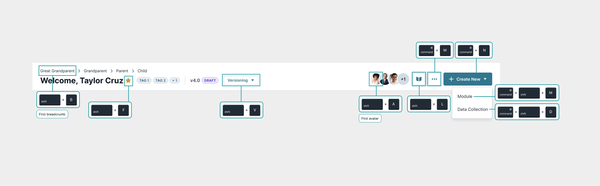
For users to learn quick about how to implement these shortcuts in their workflow, I designed visible hints like tooltips showing the actions related to the shortcuts.
Below is an example of how I documented these shortcuts internally! 👇🏼
Defining Keyboard Shortcuts
I also took the initiative to define and document keyboard shortcuts as a self-starter project to ensure they were intuitive, consistent, and accessible.
I researched existing shortcuts, analyzed our user workflows, and started documenting all shortcuts that we could implement in the product in a spreadsheet.
For users to learn quick about how to implement these shortcuts in their workflow, I designed visible hints like tooltips showing the actions related to the shortcuts.
Below is an example of how I documented these shortcuts internally! 👇🏼
WHAT IS CURRENTLY COOKING IN THE OVEN
As stated at the beginning of this project, accessibility for Unqork means not only making sure our product is accessible but also providing the tools needed for our users to ensure that their applications are accessible since we can’t predict what users will build or how they will style their applications.
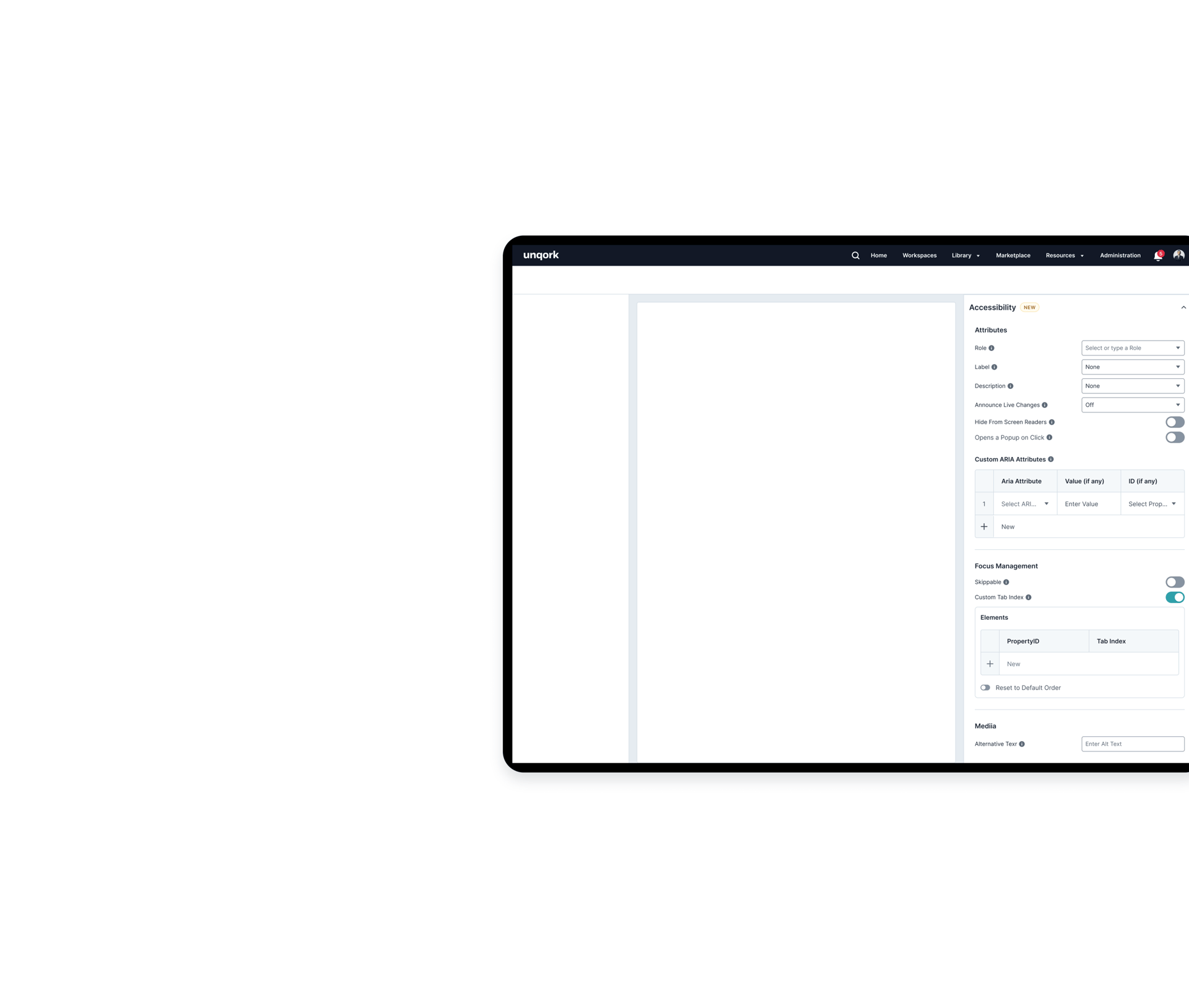
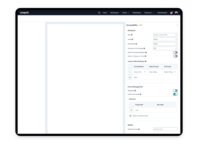
As part of a design-led vision project, I created the concept for the Accessibility Hub to empower users to make their applications accessible without any code.
The Accessibility Hub is a tool that adds an extra layer of accessibility to ensure applications are accessible regardless of how they were built.
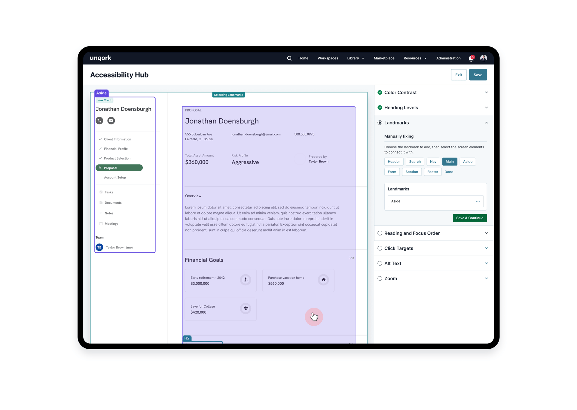
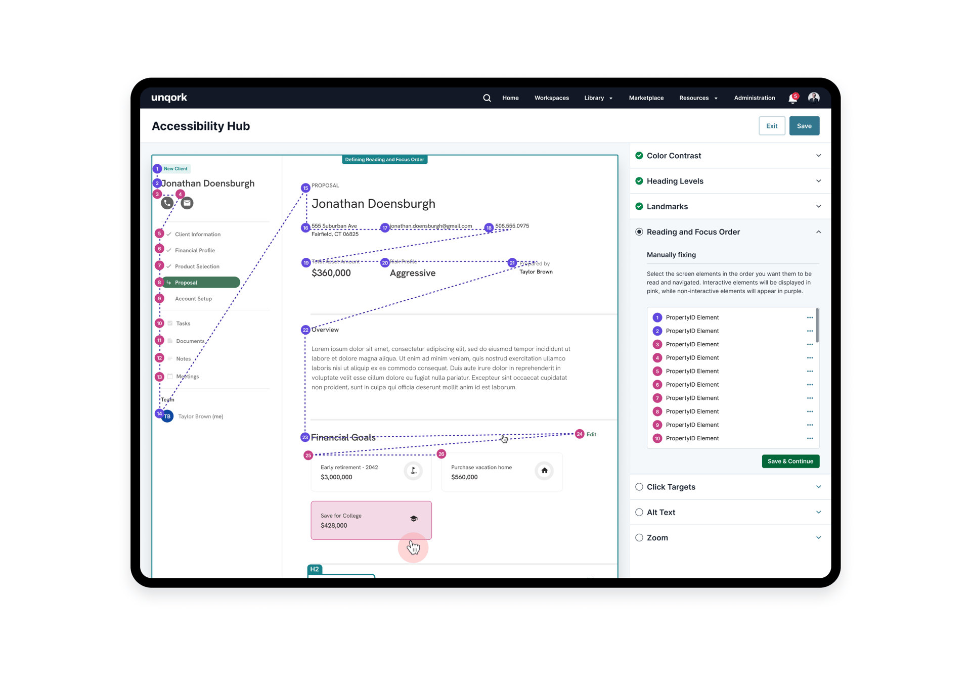
The Accessibility Hub
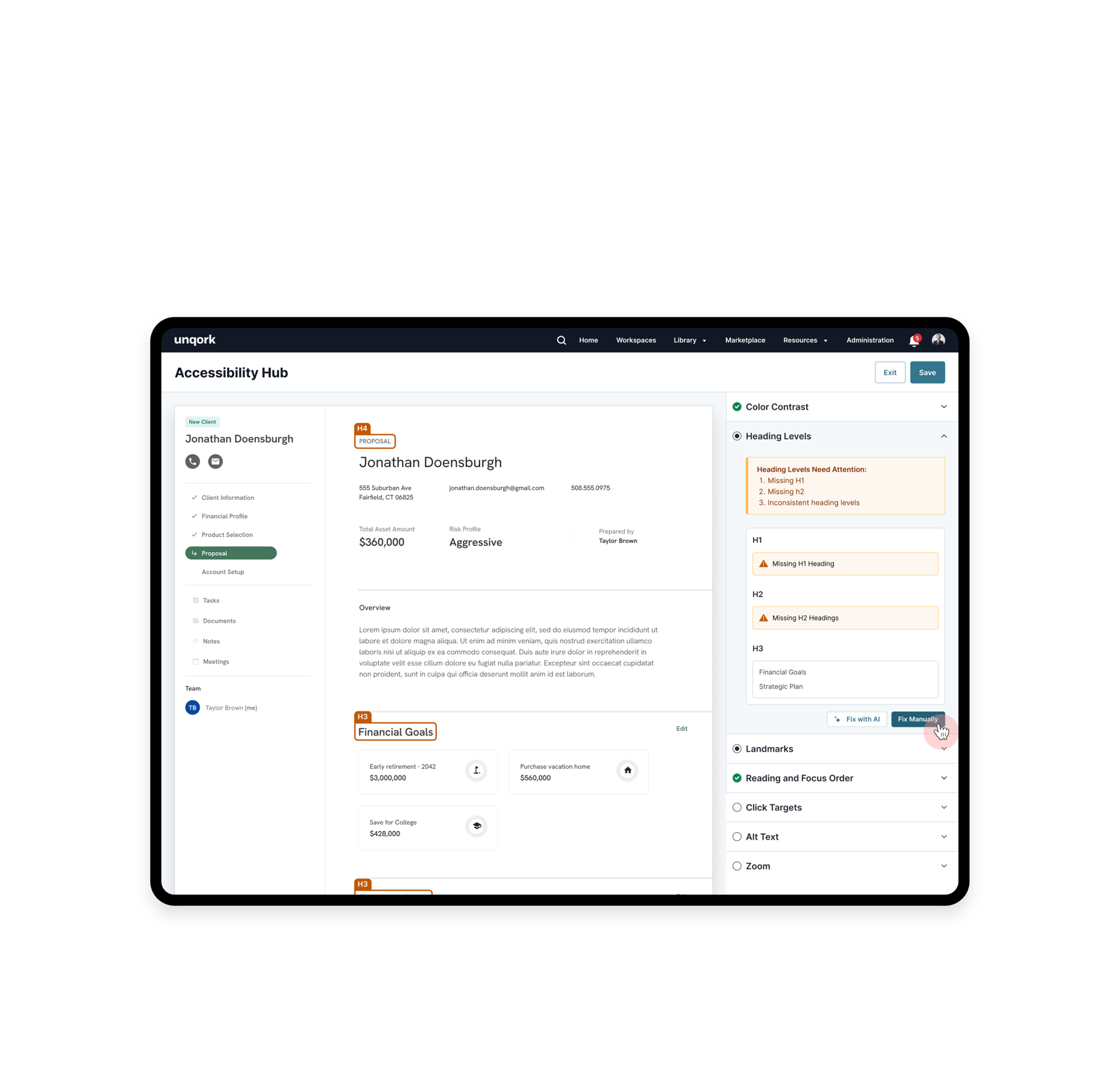
The A11Y Hub scans for accessibility issues and highlights problem areas

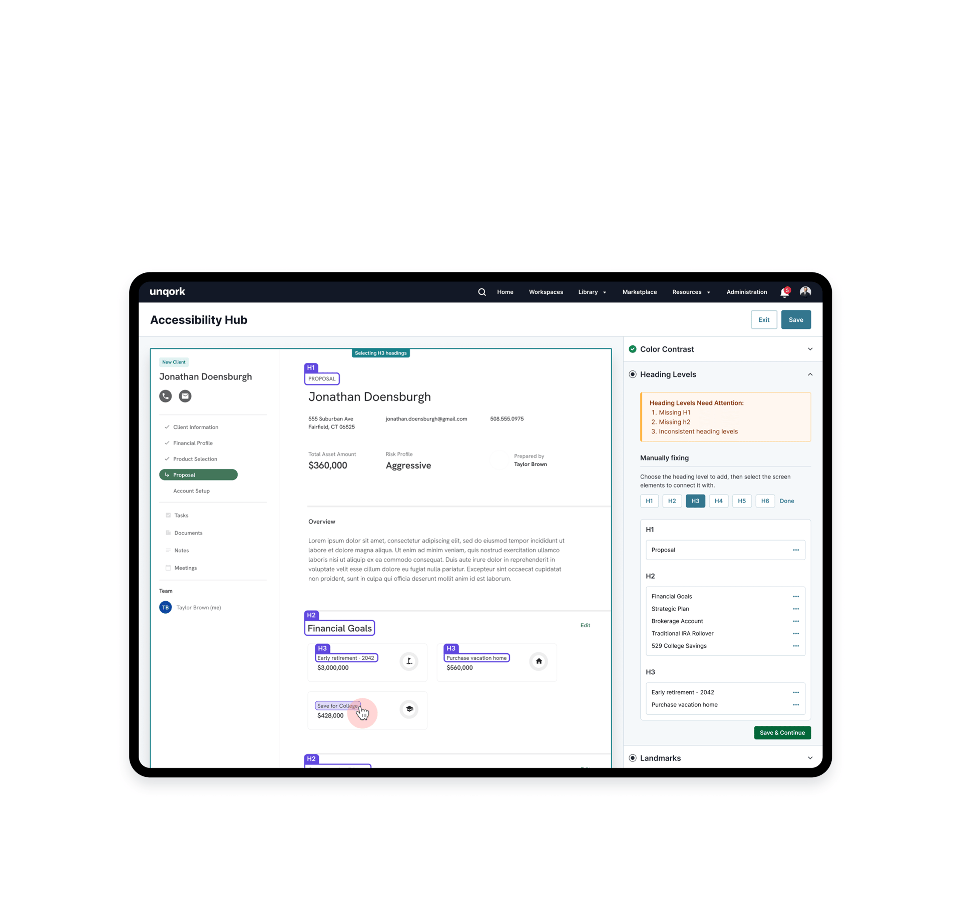
And empowers users to make their applications accessible without any code!
THE OUTCOME OF HARD WORK ♥️
Designing a Scalable Token System & the Style Manager
MORE PROJECTS